In the past I've most always favored function over form. Perhaps it's the practical engineer within me. Aesthetics? An added bonus only if it is on top of superior performance.
But, I think Apple has gotten to me. Make no doubt, I like Apple products, current backlash non-withstanding. I'm no fan boi but there's something about Apple's design aesthetic. Granted, the products are pretty good (but there have been bombs along the way too -- Mighty Mouse I, Time Capsule, Newton...) but I truly appreciate the aesthetic. The products are beautiful. However, beyond the products themselves, the packaging in its own right has an aesthetic and beauty that is unmatched. It's a joy getting and opening a package from Apple.
This is the box my MacBook came in:
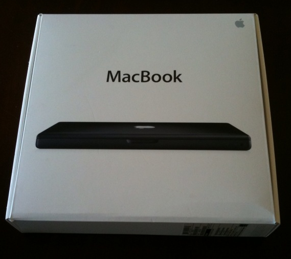
It speaks to me and I can't wait to open it. It screams Fun. Sexy. Cool.
Compare this to:
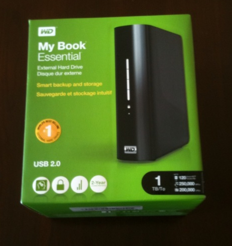
From a utilitarian perspective, this is a great product. A terabyte disk for less than $130! (Moore's law and increasing disk densities -- that's a blog post for another day). It clearly says (in a boring kind of way), "Here's that big disk that you wanted." But it doesn't generate the excitement of the joy of opening that box of the MacBook.
And this:
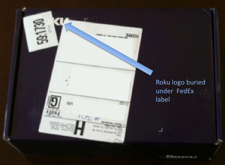
This is the Roku device that let's me play movies from Netflix on my TV from the Internet. It's wireless (and wired) and makes on-demand movie viewing at home easy, fun, and awesome. It's $100. It's truly an amazing device! And, yet, when it showed up on my doorstep, I was nonplussed, disappointed and bored. The aesthetic of the packaging (never mind any potential coolness is hidden behind the FedEx labeling) is a huge yawn. For such a great device and awesome experience it will be, initial disappointment is not the first impression Roku should want to create.
The Apple experience is end-to-end. From the announcement at MacWorld (potentially preceded by leaked rumors), the branding and advertising, the in-store experience, and the packaging, a frenzy of excitement is created. It's like Christmas morning as a kid every time you get something new from Apple. The packaging is a huge differentiator.
Never mind if the product is any good.
Footnotes:
This goes beyond product. Check out how an Apple offer letter is packaged. I hope the job is just as good.
And, here's how Microsoft might approach packaging:
Finally, I can't wait for the the Tablet, iState, or whatever is being rumored.
But, I think Apple has gotten to me. Make no doubt, I like Apple products, current backlash non-withstanding. I'm no fan boi but there's something about Apple's design aesthetic. Granted, the products are pretty good (but there have been bombs along the way too -- Mighty Mouse I, Time Capsule, Newton...) but I truly appreciate the aesthetic. The products are beautiful. However, beyond the products themselves, the packaging in its own right has an aesthetic and beauty that is unmatched. It's a joy getting and opening a package from Apple.
This is the box my MacBook came in:

It speaks to me and I can't wait to open it. It screams Fun. Sexy. Cool.
Compare this to:

From a utilitarian perspective, this is a great product. A terabyte disk for less than $130! (Moore's law and increasing disk densities -- that's a blog post for another day). It clearly says (in a boring kind of way), "Here's that big disk that you wanted." But it doesn't generate the excitement of the joy of opening that box of the MacBook.
And this:

This is the Roku device that let's me play movies from Netflix on my TV from the Internet. It's wireless (and wired) and makes on-demand movie viewing at home easy, fun, and awesome. It's $100. It's truly an amazing device! And, yet, when it showed up on my doorstep, I was nonplussed, disappointed and bored. The aesthetic of the packaging (never mind any potential coolness is hidden behind the FedEx labeling) is a huge yawn. For such a great device and awesome experience it will be, initial disappointment is not the first impression Roku should want to create.
The Apple experience is end-to-end. From the announcement at MacWorld (potentially preceded by leaked rumors), the branding and advertising, the in-store experience, and the packaging, a frenzy of excitement is created. It's like Christmas morning as a kid every time you get something new from Apple. The packaging is a huge differentiator.
Never mind if the product is any good.
Footnotes:
This goes beyond product. Check out how an Apple offer letter is packaged. I hope the job is just as good.
And, here's how Microsoft might approach packaging:
Finally, I can't wait for the the Tablet, iState, or whatever is being rumored.

